

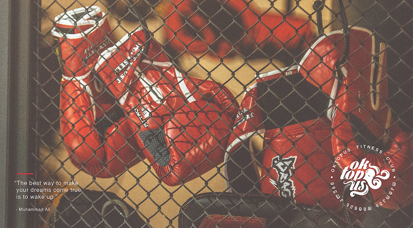
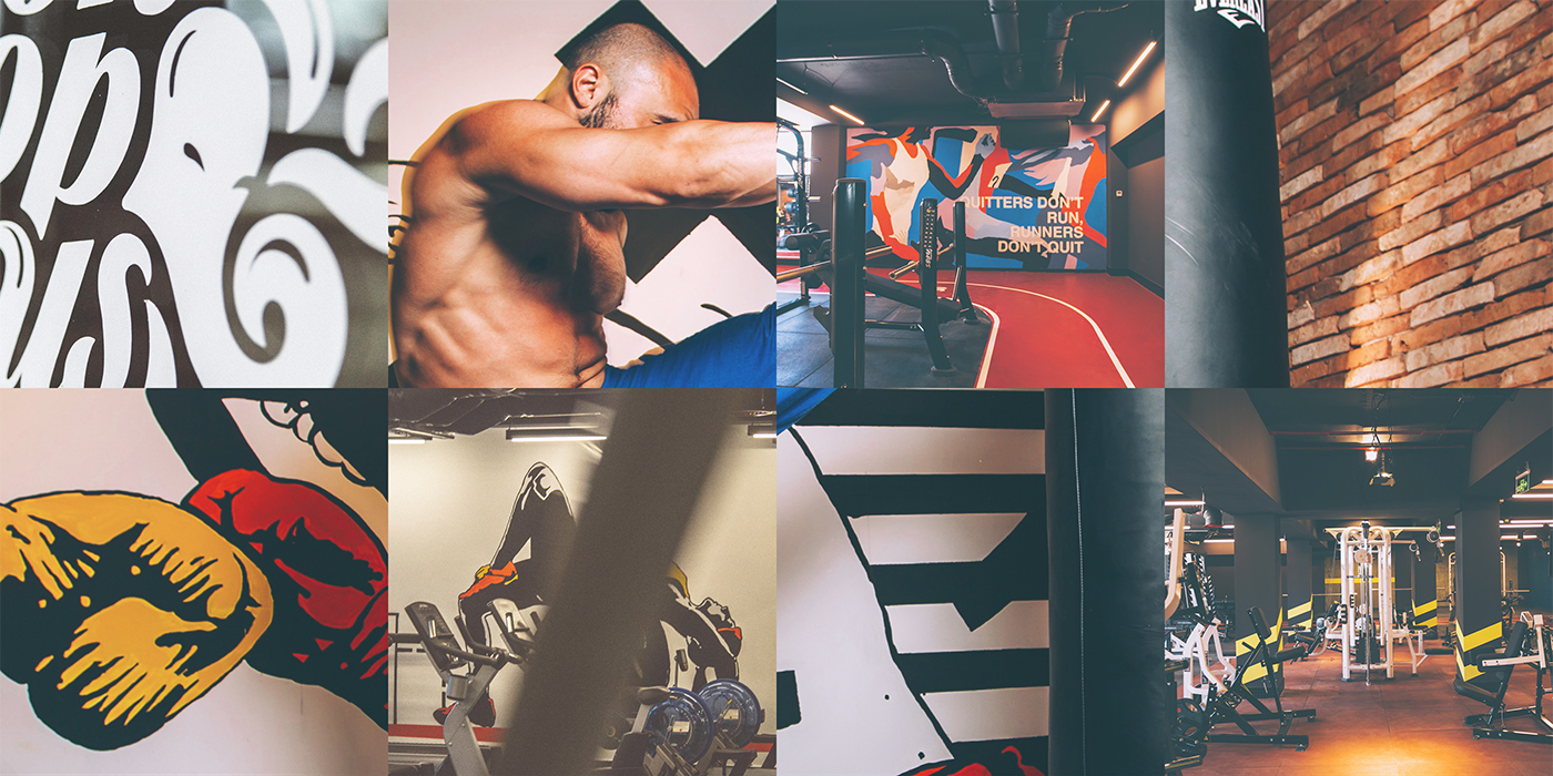
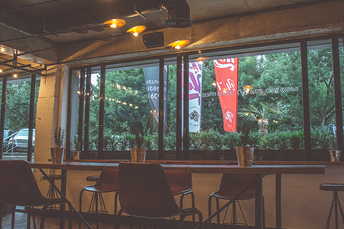
The naming of a recently launched fitness club in Tbilisi – OkTopUs embraces three
principal brand values:
Ok – for positive and inspirational spirit
Top – for competitive, winning mentality
Us – for friendly, club atmosphere
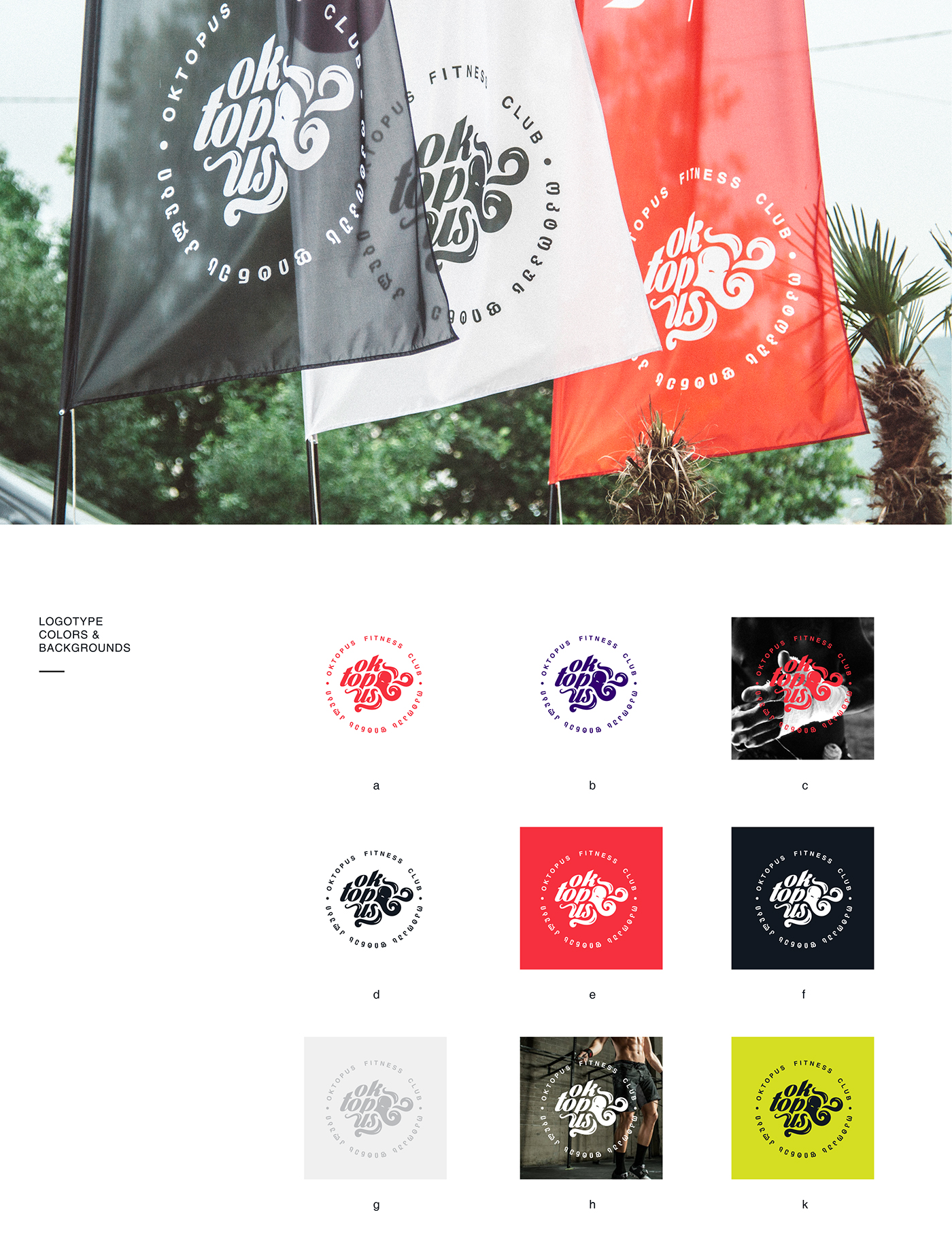
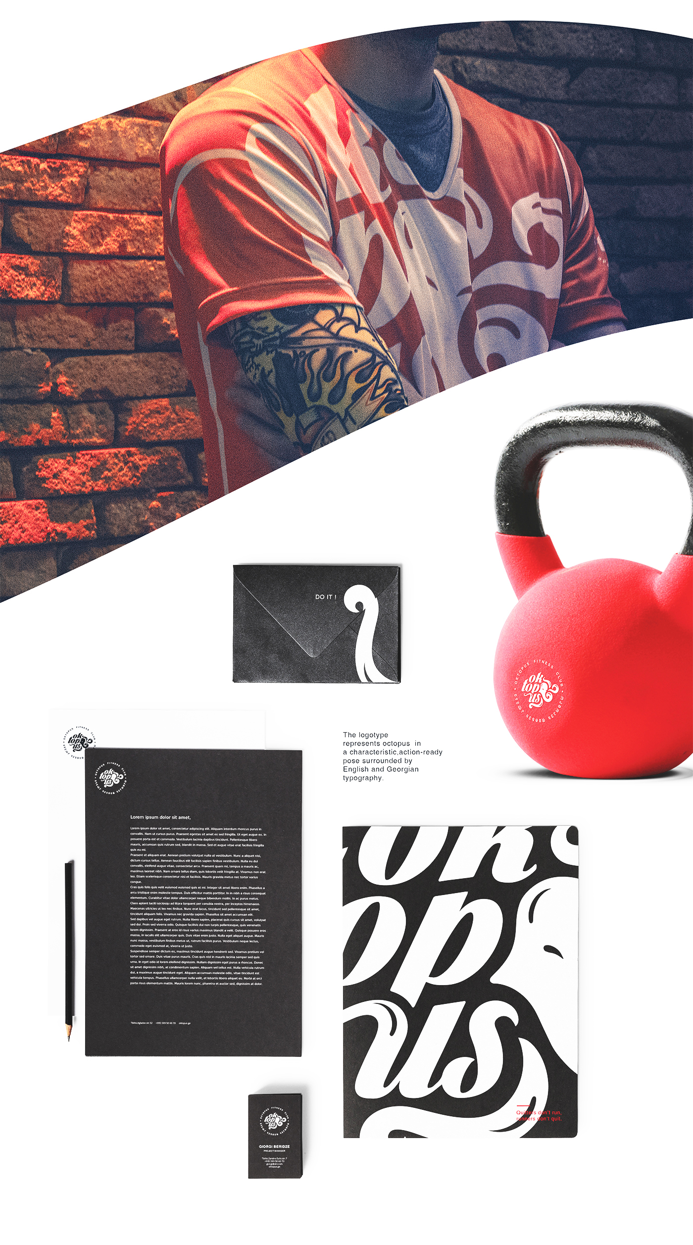
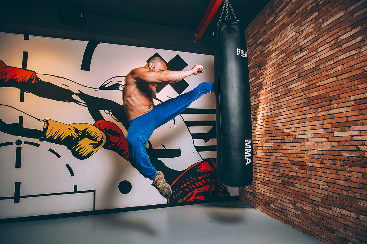
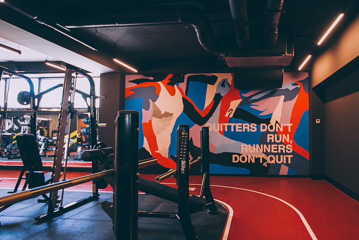
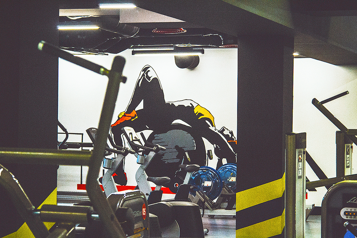
We then went on to create our own octopus symbol to represent free-spirit, fun and
creative manifestation of positive energy. In visual identity we also focused on and
developed three main elements:
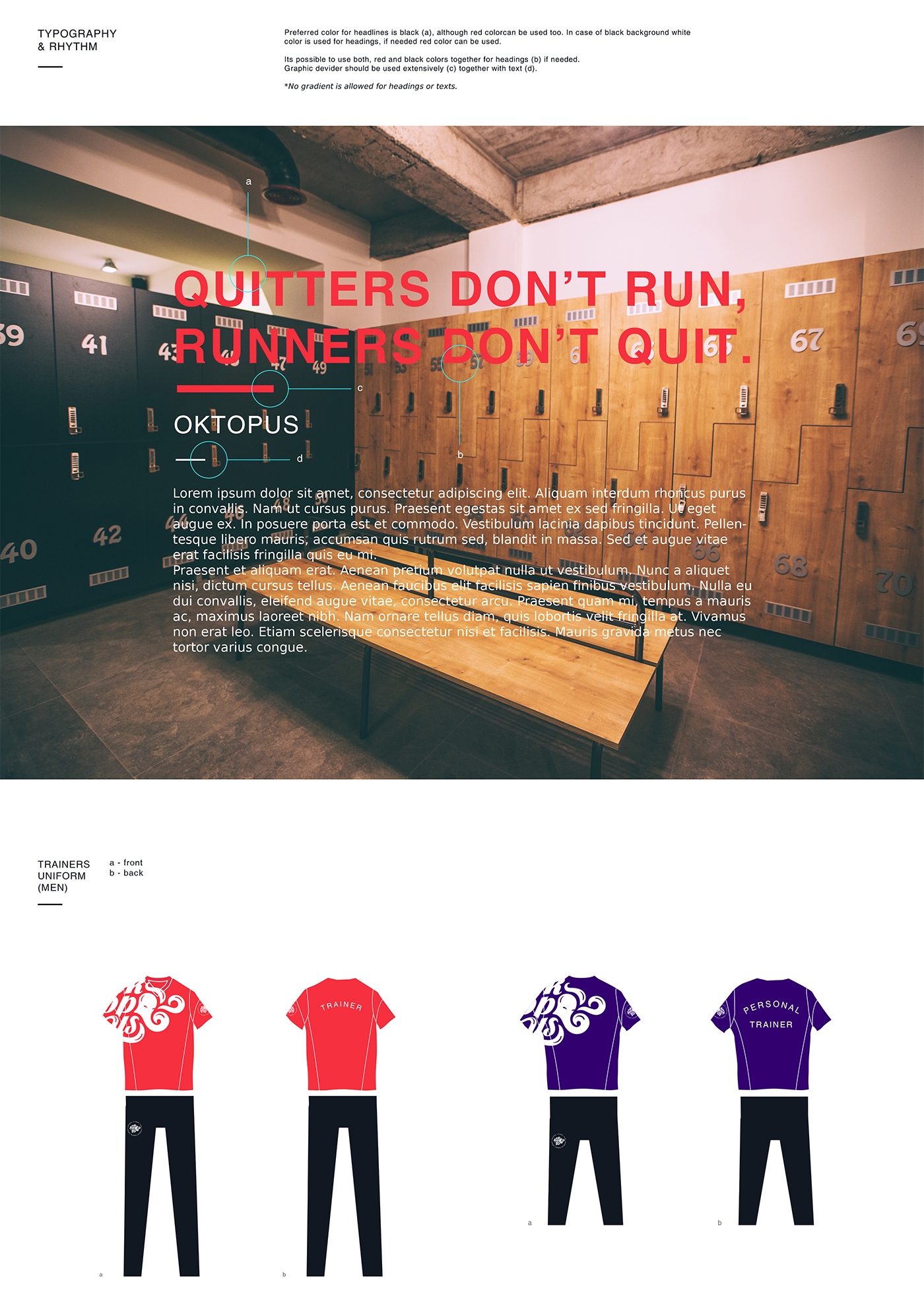
Colors – bold, vibrant strokes in graffiti style
Character – purposeful, determined facial expressions
Shape – unique, memorable and flexible


Agency — Windfor's Communication.
Account Manager — Tamar Tsintsadze.
Strategy — Lado Malazonia & Vaska Chubinidze.
Creative Director — Vato Kavtaradze.
Art Direction — Ruslan Beridze & Zakharia.
Graphic Design — Ruslan Beridze & Zakharia.


